From brand book to website: the decisions behind the Helsten site
Leal designed and built the website for Helsten, the largest knife and cutting solutions company in Latin America, under Tela Marketing's direction. The site turns the new identity into interface, gives each industry its own page, carries the brand's technical line into icons and motion, and stays light and easy to find on a phone.
Published · 3 min read
In short
- A brand identity becomes a website by using its own tools: its colours, its line and its type, with nothing added.
- One page per industry gives buyers a direct way in and the sales team one link for each kind of client.
- Motion lives in one place, where the company tells its own story.
- A lighter film at the top of the home made the page appear more than a second sooner on a phone.
Helsten has been making industrial knives and cutting solutions in São Paulo for more than forty years, for tissue, paper and pulp, wood, steel and cardboard mills across Latin America. In 2025, Tela Marketing led the company's new positioning and identity, and brought us in to design and build the website that would launch it.
From brand book to screen
Tela Marketing's identity rests on one idea, transformation with precision, and on a few exact tools: a deep navy, a light blue taken from the wordmark, thin lines and small labels in a monospaced type, like the notes on a technical drawing. The site uses those and nothing else, so every page reads as Helsten before anyone reads a word.
A blade that draws itself
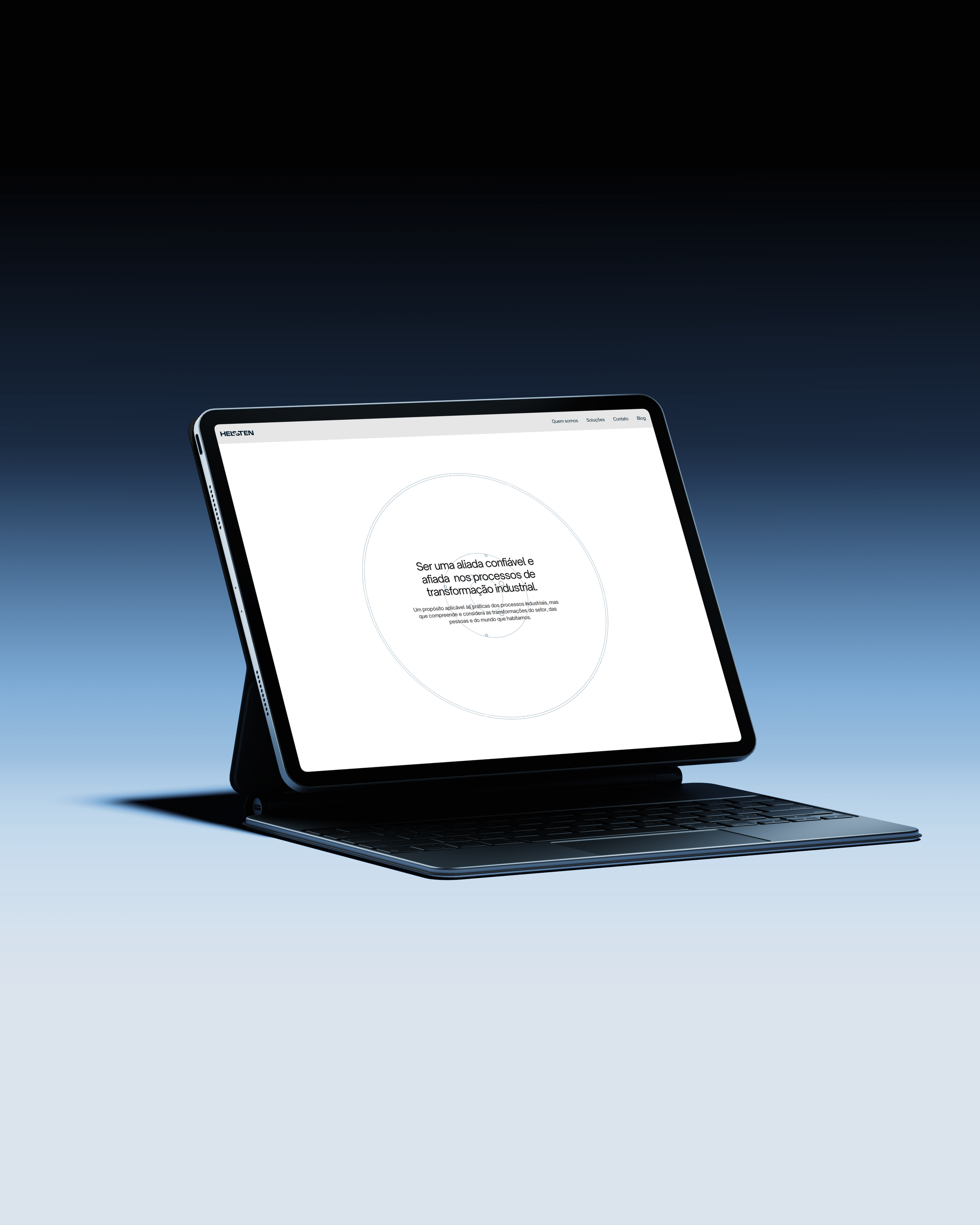
The About page opens with the company's purpose inside a circle. As the page scrolls, the outline of a circular blade is drawn around it, line by line, until everything settles in the middle of the screen. It is the only long animation on the site, and it sits where the company tells its own story.
A page for every industry
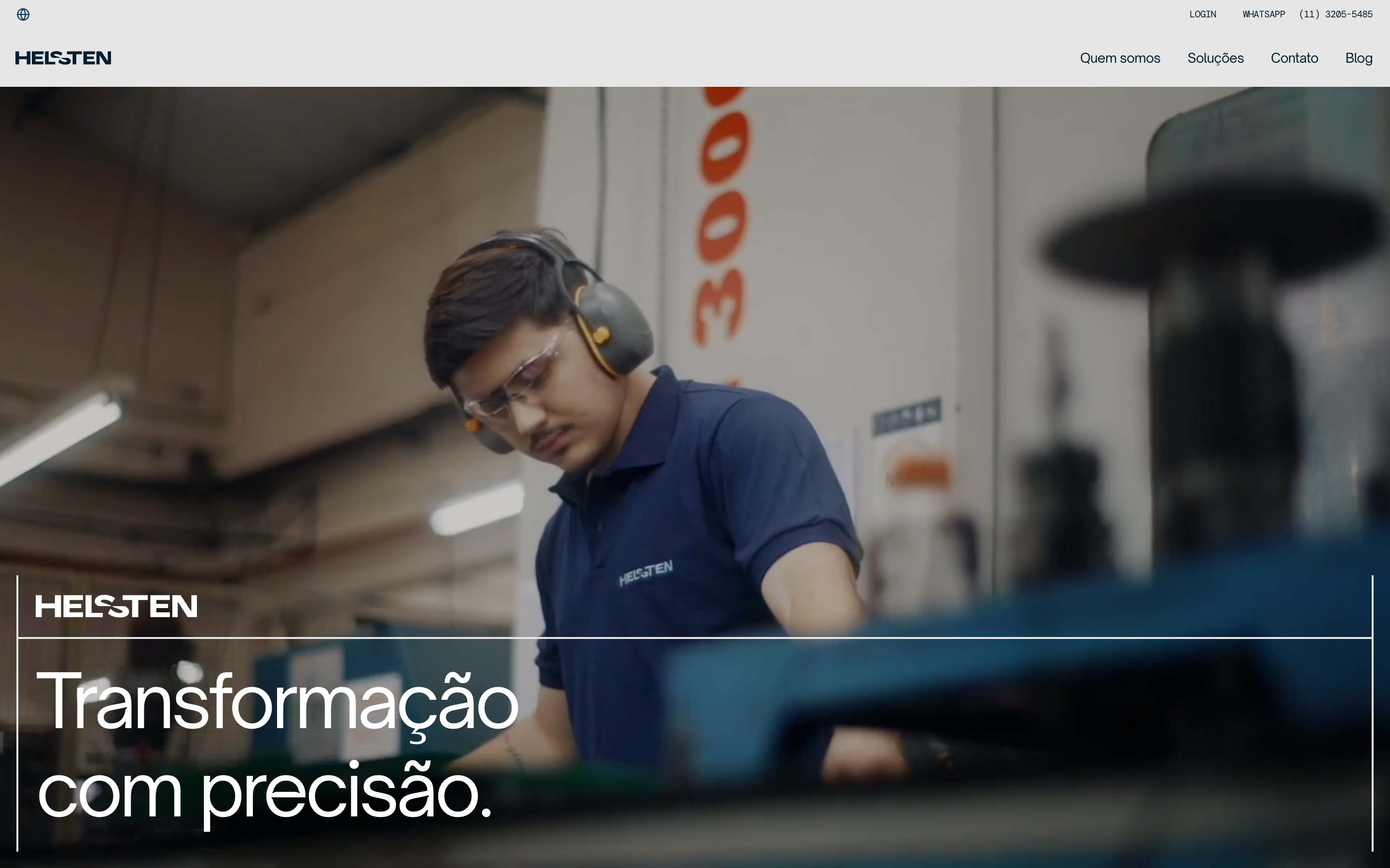
Each industry Helsten serves has its own page: tissue, paper and pulp, wood, steel, cardboard, and one for everything else. Every page opens with a photograph of that industry, explains what the knives do there and lists the products. A buyer lands on what matters to their mill, and the sales team has one link to send to each kind of client.
Icons from the technical drawing
What each product line does well is shown in cells, each with a line icon drawn for the site: a saw blade, a flying knife, a grinding wheel, a nut. They are made of the same thin line as the rest of the identity, so even the smallest detail belongs to the brand.
The same site on a phone
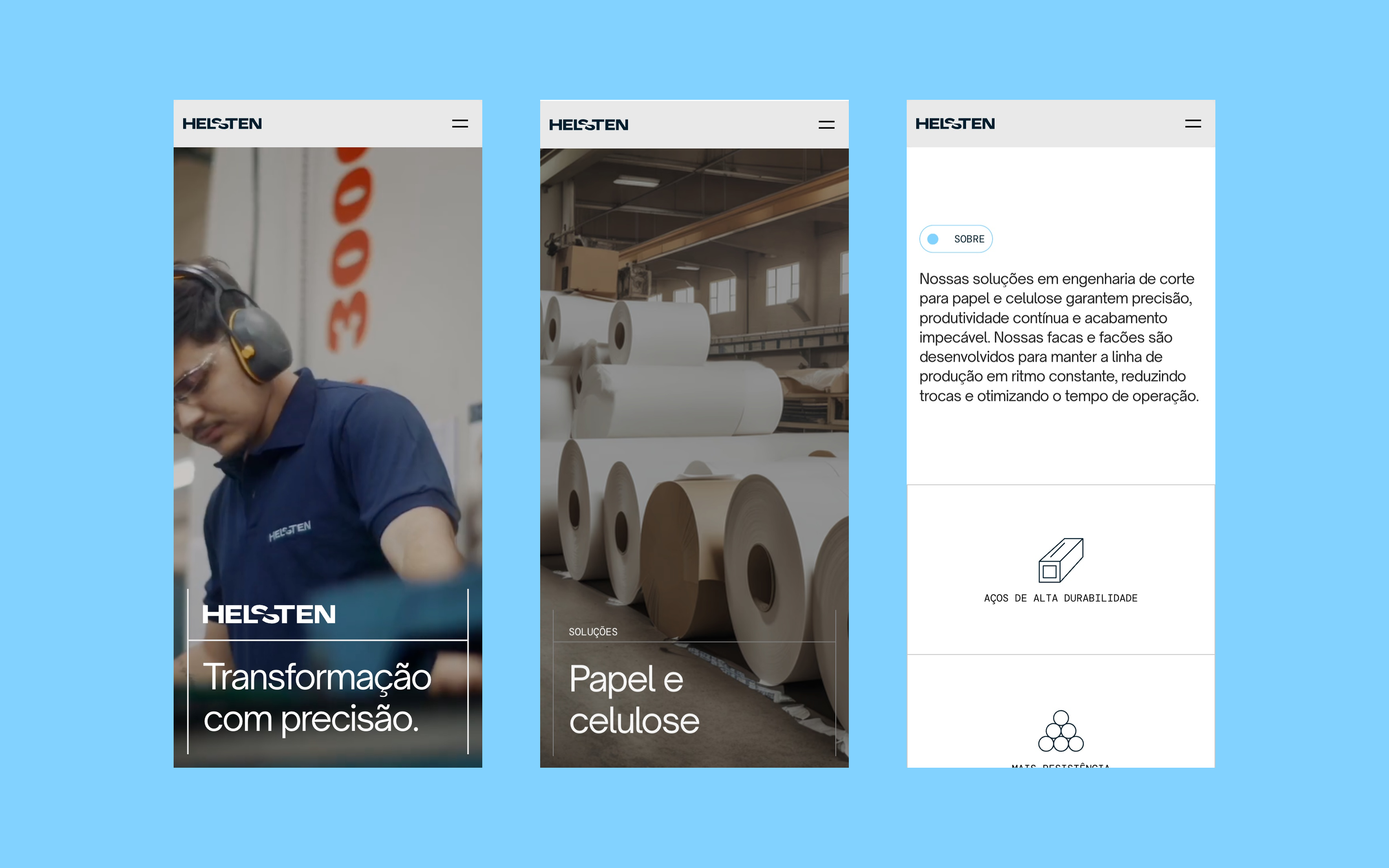
On a phone, every section stacks into one column, the photographs keep their weight and the menu opens over the whole screen. Nothing is left out of the smaller version: the industries, the products and the contact are all one tap away.
Light, and easy to find
The film at the top of the home was made much lighter with no visible difference, and the page now appears more than a second sooner on a phone. Every page has its own title and description in search results, and the company's details are published in the format that Google and AI assistants read directly.
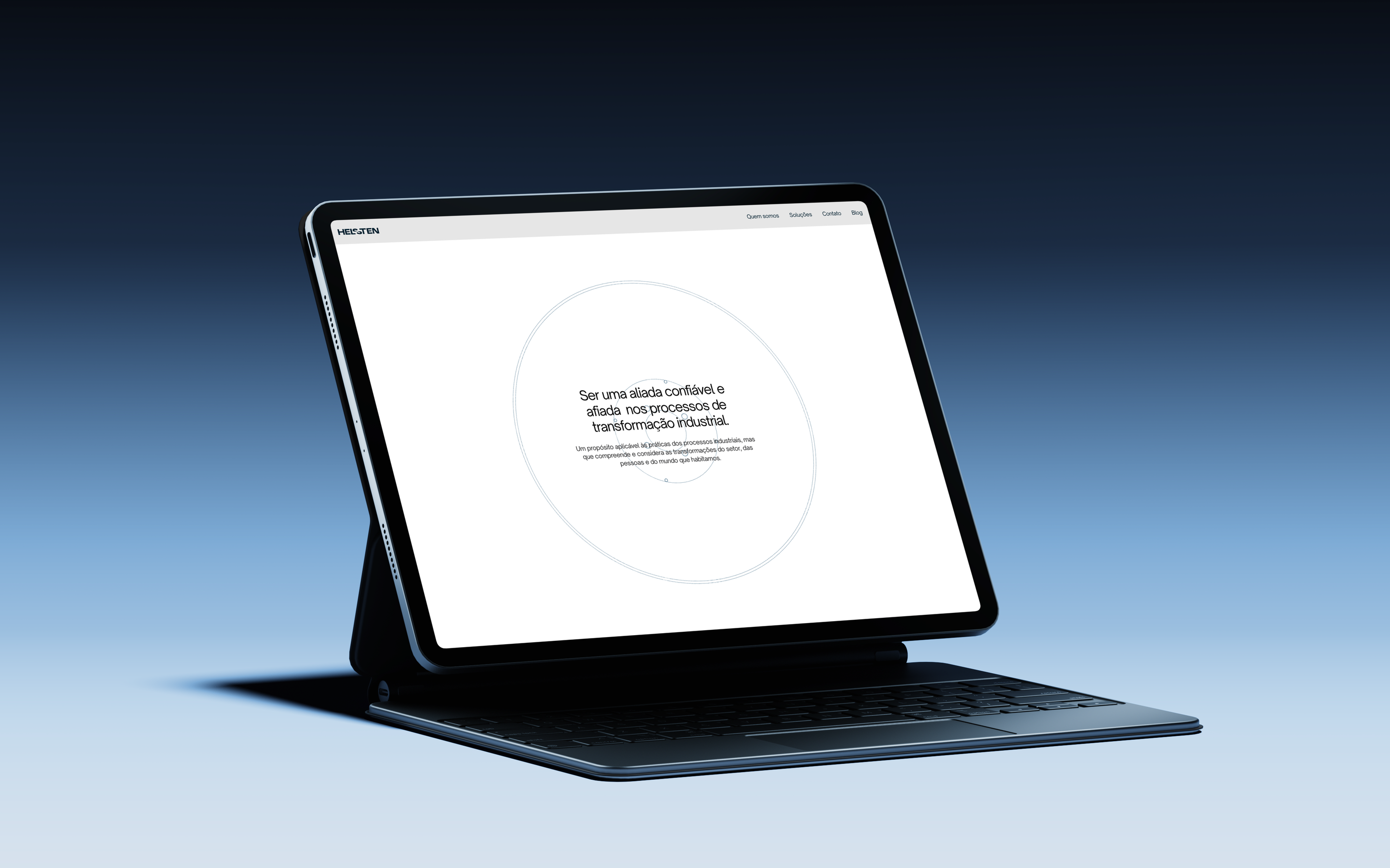
The site did not stop at the launch. Every month we review it, act on what the numbers show and send Helsten a report of what changed.
Project direction by Tela Marketing. Website design and development by Leal.
What we measured
- Time for the largest element of the Helsten home to appear on a phone
- 4.0 seconds
- Lighthouse 13.5, mobile, median of three runs on 6 October 2026, after the film at the top of the home went from 10.4 MB to 3.7 MB. On 2 October, with the same method, it was 5.6 seconds.
Work behind this
- Helsten · Industrial precision, engineered for scale.